An online store is your product, your business card, and your income directly depends on how user-friendly it is for the user/customer.
Design elements in the site interface that you should pay attention to first of all:
- Site search and advanced navigation. Even if you have a good internal search of the site, according to researches, 70% of users will first open the menu and go through the sections of the site.
- The menu should draw attention. I advise you to place all important information, the site logo and the main navigation on the left side in the F format. You can read more about this in our article about website usability here.
- Don’t play with fonts. Leave 2-3 basic fonts.
- The registration form must contain less than 5 fields and the ability to register via social networks.
- A simple multi-step checkout is the key to success. Checkout should be quick and easy.
- Enter your phone number in the header and add a convenient feedback form.
- Navigation elements. I recommend to add an “Up” button to make it easier for the user when he/she goes down and will look for the scroll bar.
- A lot of annoying pop-ups when entering the site force the user to close the tab with your resource in the first 5 seconds of interaction. Better to give them up.
- Service pages. Customize them and pay attention to fill them no less than product cards.
We will now go through each item in greater detail.
- Purchase without registration.
Purchasing without registration is a must-have among online stores. You should provide a person with the opportunity to buy your product quickly, without wasting time on additional filling of fields and unnecessary clicks. 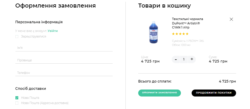
- Registration via social networks.
This is a good alternative to regular website registration. This will allow you, as a business owner, to obtain additional potential customer data and use it for further advertising and remarketing. And the customer will have an access to the personal account in just 1-2 clicks. 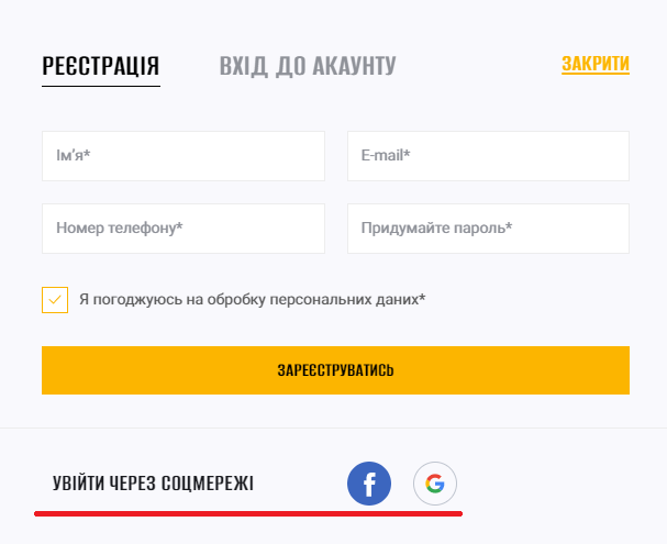 The website doesn’t have enough customer registrations? Tell in the block with registration about the benefits that the person will receive. For example: access to order history, tracking packages, loyalty program. Make registration with the minimum number of required fields.
- One-click buying.
There is a certain category of people who find it easier to leave their phone number in the form and wait for a call from the manager. Others make a purchase on the website on their own. Consider this audience when designing your store. 
- Step-by-step checkout.
Divide the checkout into several stages. Do not show the person at once the 100,500 fields that he must fill out. First, personal information – 4 fields maximum, the next step is selecting a delivery, and the final step is selecting a payment method. When person fill in the fields in the first step and go to the next screen, he/she will have much less desire to refuse a purchase. 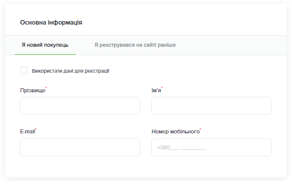
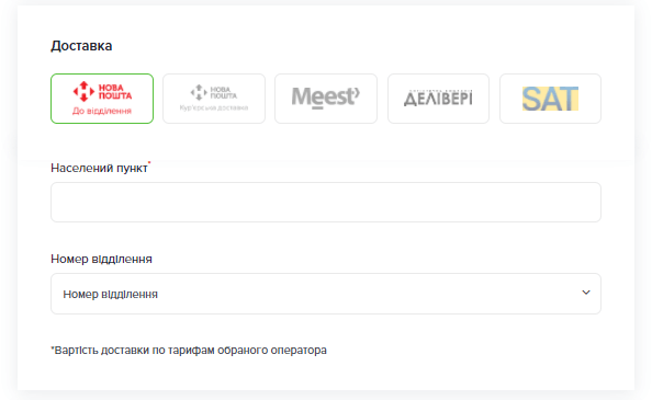
- The “I don’t need to call back” mark in the checkout.
In contrast to the previous point, there is a category of people who do not really like to communicate with managers by phone. Even to clarify the details and even if it takes a minute. They demand complete store work automation.
My own experience: if the audience of your online store is 18-23 years old, they will basically refuse the order when filling out the checkout because the option “don’t call me back” is missing. This is how it is – the buzzer generation 🙂
- Quick add buttons to the cart.
Especially relevant for sites that sell inexpensive goods. For example, household chemicals, cosmetics, food. Usually a person is already familiar with some of the site’s positions and is ready to add them to the cart directly from the catalog page, without looking at the details in the product card. 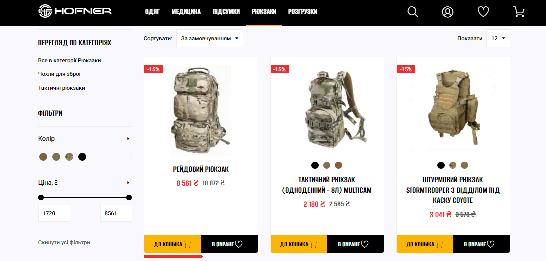
- Blocks “You might like this products” or “Similar products”.
This is something that can really increase not only the time customer spent on the site, but also significantly increase the average check. It is especially important for niches where the rules of impulse purchases work well: clothes, cosmetics, food, decor items, books … It is important to place such blocks at the bottom of the pages of a certain product. 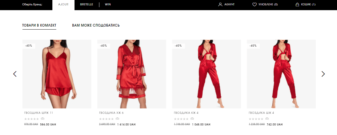
- Permanent promotional offers.
They should be placed in the form of promotional banners or as a separate block with goods on the main page of the site. You can create a separate page with promotions.
The website doesn’t have enough feedback from clients? Make discounts on the next purchase after writing a product review. Encourage your buyers to write feedback in exchange for discounts. You can notice customers about such benefits immediately after the purchase.
Does the site have to be adaptive?
If your site does not adapt to different devices – laptop, tablet and phone, the chances of selling goods or services are halved. The high growth in phone purchases began in 2020, during a period of constant lockdowns. 52% of the world’s Internet traffic was recorded for smartphones. And every year it grows, because it is more convenient and faster. People are better looking for products online and doing purchases through their smartphones.
Incorrect displaying of your resource on mobile devices can be the main reason why you have low conversions.
Is it important to pay attention to the design of the service pages of the site?
Personally, I am in favor of customizing the service pages: about payment and delivery, contacts and about the store. Place the logos of delivery and payment systems on the appropriate pages, formulate clear tariffs and conditions, submit information in a systematic way (in the form of separate blocks with information, and not just a canvas of text). On the store history page, tell the real story of creating a store, add photos and videos. This increases trust and, consequently, the overall conversion of the store. Before starting your website design, provide the designer with the information and content for these pages.
Information is precious! We are sure that now your online store will be able to increase sales easier and faster, and users will become regular!
We have a video format! 🙂 On our YouTube channel, the lead designer shares shes own experience in implementing tips for online stores and talks about design for e-commerce, showing examples and cases.
All business owners in e-commerce – we recommend to see first of all!


