Do you want to sell via the Internet more? Properly selected website design and quality photos will help to underline all the features of the goods. In this article, we will consider 5 alternatives to the white background for photos of goods, which will help to stand out and attract the attention of buyers exactly to your product.
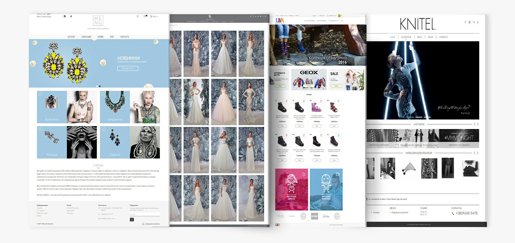
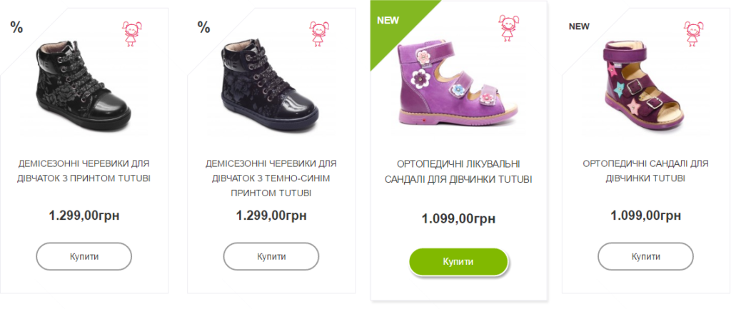
Online stores often choose photos on a white or transparent background. This is not surprising – white background perfectly adapts to the website design, and all goods can be shown perfectly. The safe option is if your visitor knows exactly what he wants. An excellent example of implementation is L.I.Y.A. – you can review orthopedic shoes for a child in details, in order to ensure the quality and convenience. It only remains to choose the size and click the “Buy” button.
And if we are talking about products that are “harder” for visitors to choose from? For example, women’s clothing – the same model of dress in different colors looks quite different. We offer you 5 alternatives to a white background to help distinguish your product from others.
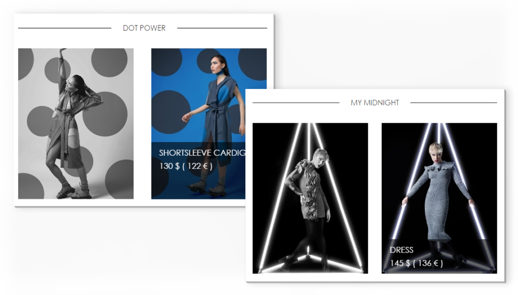
1. One collection – one background
Especially this option is suitable for clothing and accessories websites. If you want to stand out from the competitors, and at the same time emphasize that all things belong to a fashion collection – just take a look. An example of implementation for site Knitel. The unique background is selected for each collection. Also, the common style of the website remains.
2. Instagram photos – conversion to the website from your account, and vice versa
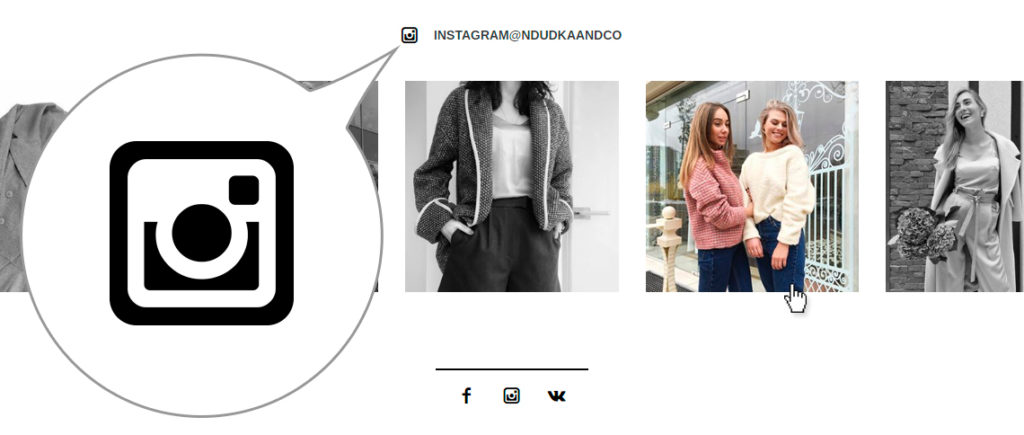
Quite interesting and actual idea – not just to make a social Insta button, but to hitch photos from your account to the website. Suitable for active Instagram users. This option will help the visitors to make themselves at home. When ordering goods you have the feeling that you talk with a good friend in social networks. At the same time, the transition from an account to the website and back is supported, which helps to promote the online store. Recently, we have described an example of the implementation on website Natali Dudka.
3. Atmospheric photo – background from shooting locations
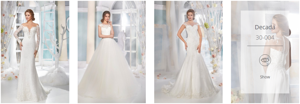
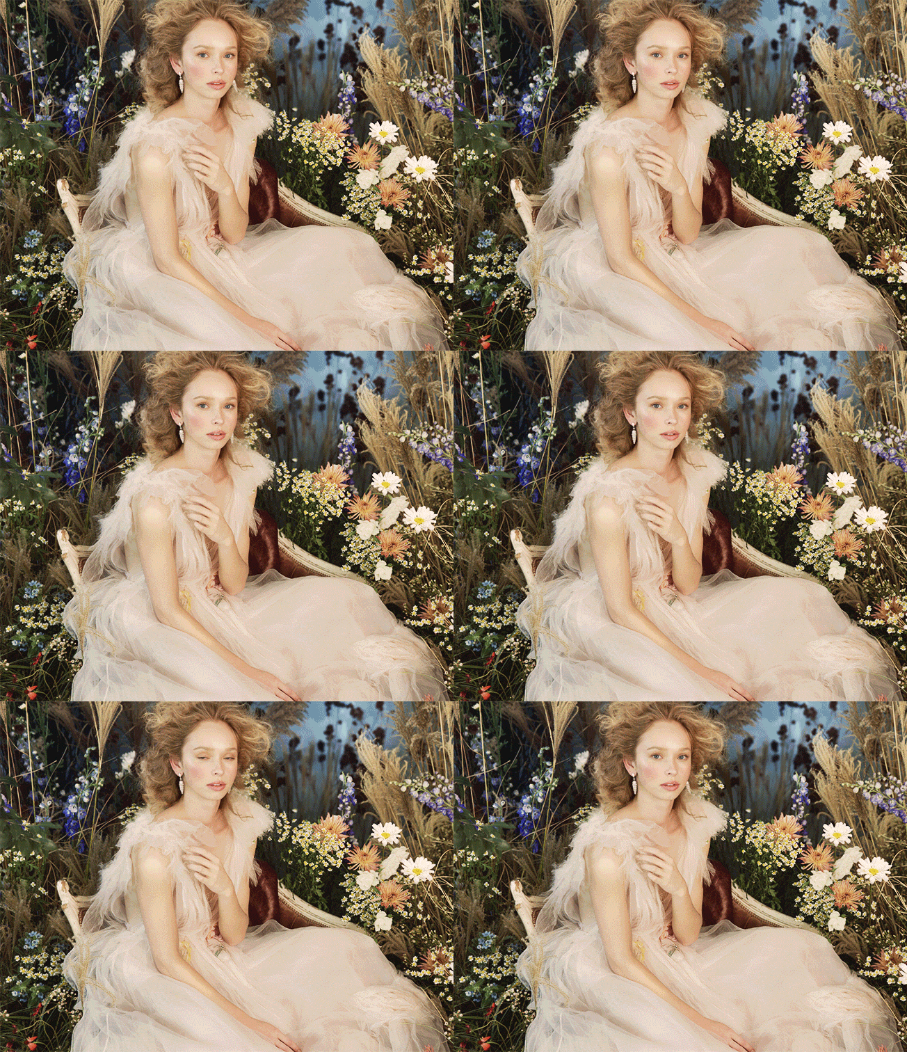
Photos taken in the interior or on nature perfectly capture the mood. But two-thirds of consumers make purchases under the influence of emotions. In this case, it is better to make website design in restrained tones. All girl’s dreams about the perfect wedding embodied in the Natali Styran wedding online catalog.
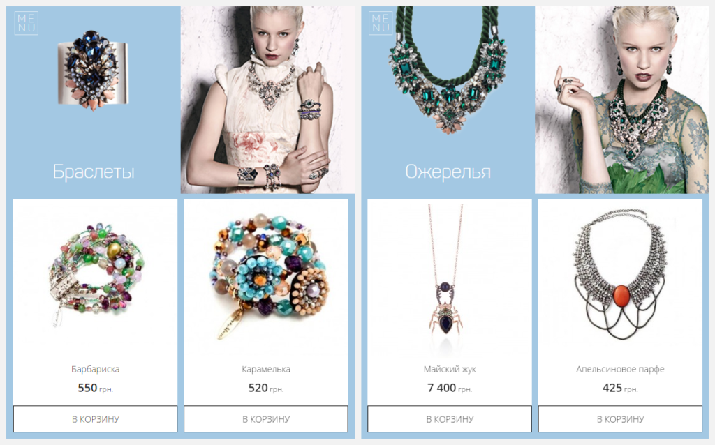
4. Saturated color – alternative to the white color
Bright color accent on the background should be very carefully overplayed by web design, otherwise, the user will be dazzled. In MenuShop photo of the goods on the bright background are used only for categories screensavers, and then follow the link to the catalog background turns white again.
5. GIFs come into fashion again
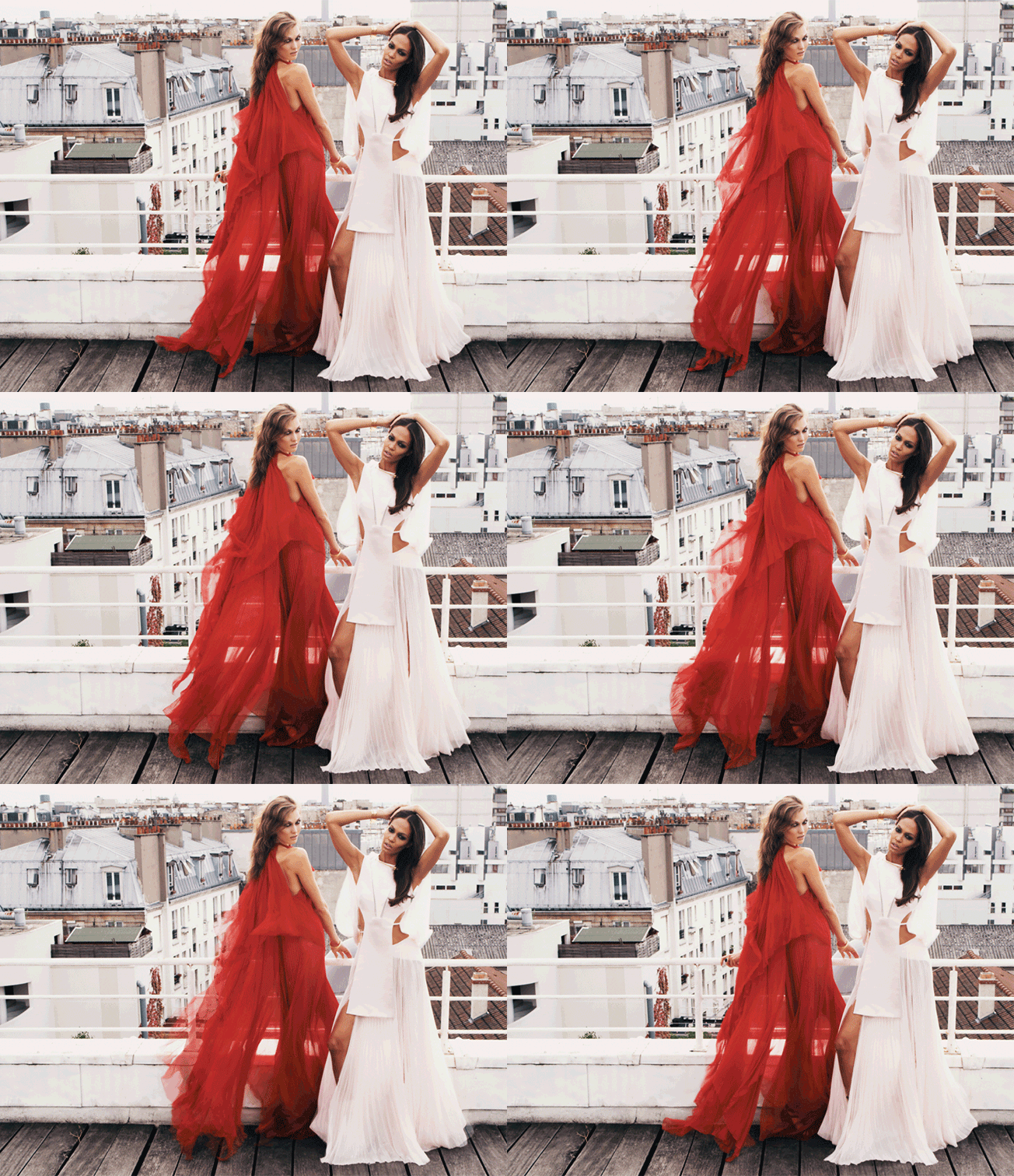
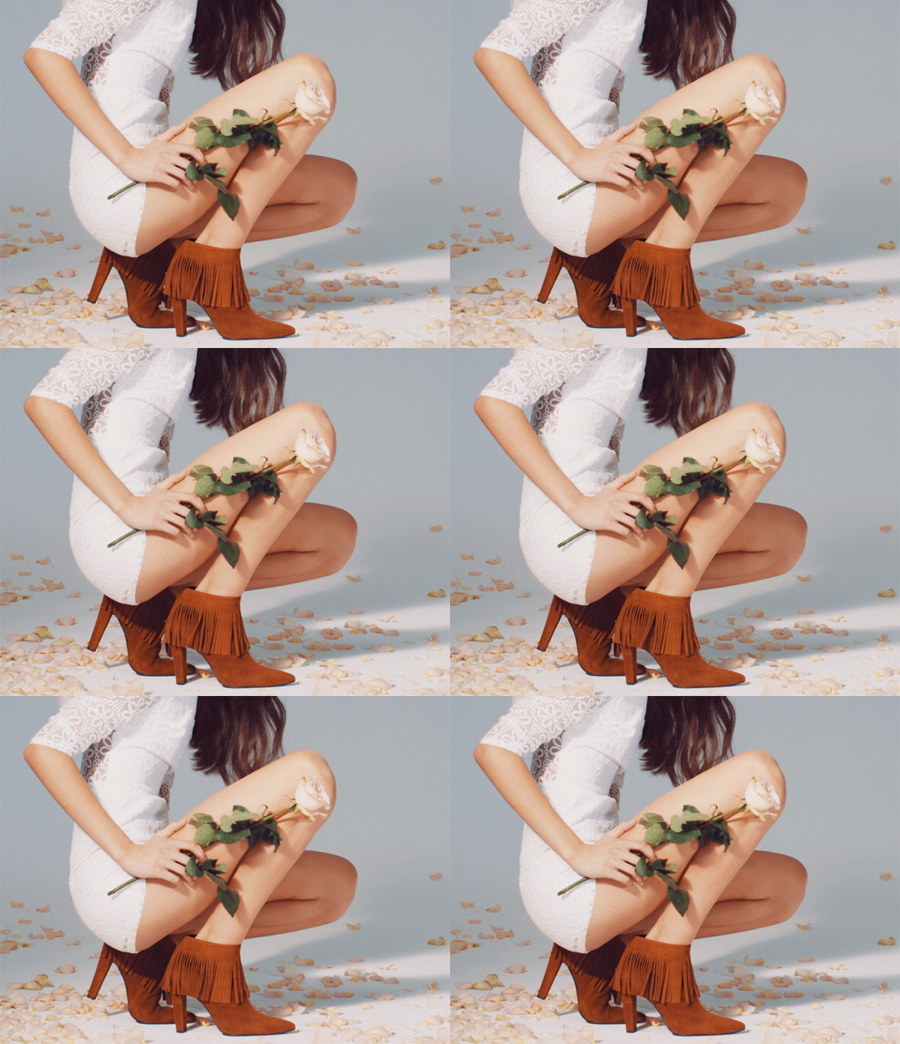
No, not the old vulgar animations. In the new version moves only one perceptible element. The picture is active and exactly attracts attention. Experts say – this option will be relevant in 2017. Of course, users can decide whether it will get accustomed, but we decided to share with you. If you like experiments, we can try to do something similar for you – a few “live” pictures among the static gallery will help to bring in a zest.
We have great experience in turnkey online stores development. Our designers will select the individual concept especially for You, and experienced programmers will create a website that You will be proud of. Want a unique project, taking into account the latest trends in the market? Let’s bring Your idea to life today!

