What is website usability?
The concept of “usability” in relation to Internet resources can be characterized in different ways. But the best answer to the question “What is website usability?” there will remain a literal translation of this word from: use ability – ease of use.
Is it important to take usability into account when developing a site?
Usability is one of the main aspects of web design. Therefore, it should be considered even before the development of any Internet resource: it will be an e-commerce site, or a corporate site. Usability should be part of the entire development process right away.
What is the main principle of site usability?
The first thing you need to take care of is site navigation. A poor navigation bar remains the main reason why users leave a website in the first seconds. Pay attention to where you place your navigation items, how you name them, and how you structure your sections and directories. Think like your user and foresee how he will move around your site, how to move from one section to another. Also, to improve the usability of the site, it makes sense to duplicate the main menu in the footer – the bottom of the site.

The next principle of site usability is user-friendly interface.
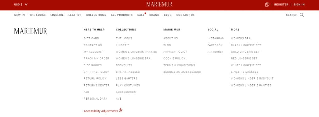
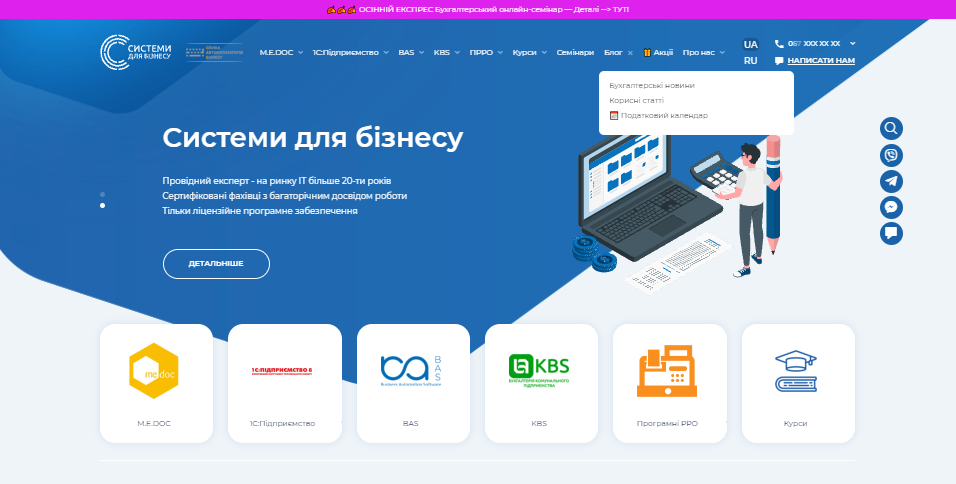
This is the so-called pleasant and “appropriate” interface for the user of your Internet resource. Websites should be designed to the target audience. If you are developing an online store for fashion lingerie, you can choose more creative design elements that would not be appropriate if you are creating a corporate website for a business.
An example of a user-friendly interface in an online store of lingerie:

View the case of an online store for a manufacturer of lingerie, swimwear and homewear.
An example of a user-friendly interface of a corporate website:

View the case of a corporate website for a company in the field of digitalization of business processes.
Fast loading of internal pages.
As we mentioned above, users leave pages quickly if they are not interested in their content. Now imagine how quickly users will leave a page if its content takes a long time to load! In fact, you don’t even need to exaggerate, 5 seconds of waiting is enough for the user to close the tab that is not loading. Fast loading of web pages is so important that Google included the “Site Speed” metric in its WEB Vitals site ranking algorithm. To get to know all the tools for assessing the quality of WEB Vitals websites, you should read this article.
Another important element for improving site usability is adaptive design.
If your site does not reflect well through the visitor’s screen resolution, it is likely that they will leave these pages. When creating a website, you need to enable the development of layouts that will fit any screen resolution. This ensures that every visitor sees a visually appealing site.
Why do you have to work on usability?
The importance of site usability is difficult to overestimate. It can even be called both a marketing and a psychological tool, because usability allows you not only to create a “cozy atmosphere” on your site, but also to direct customers in the right direction and to push them to take a certain action.
Due to the high level of usability of the site, users will be satisfied and will visit your site again, because a resource with a high level of usability is like a car with a high level of comfort, which you want to drive and travel on!
Additional recommendations for improving the usability of your e-commerce site:
- Use F-format.
Thanks to research, it is known that users read web pages in the shape of the letter F. Therefore, we advise you to place all important information, the site logo and the main navigation on the left side of the site. For large online stores, it is a good technique to show internal pages and categories on the left sidebar.

- Provide convenient search functionality.
What’s more important: easy navigation or optimized site search? Neither the former nor the latter should be underestimated. In addition, online stores visitors will definitely use the site search function when they need a specific product. For large online stores, we recommend in addition to the traditional search line, also provide an advanced search option. This will allow buyers to clarify their requests. They will be able to specify the parameters: price, brand name, sort by rating, and so on.
- Don’t be afraid of free space.
Use the distance between blocks on the site. This will contribute to a better perception of information. Also, you need to remember about line spacing in the text. The information on your site should be as accessible and easy to understand as possible – this will greatly improve the usability of the site.

- And the last, but not the least point concerns the URL.
It is best to use a short URL that is easy to remember and looks nice.
How to improve the usability of an existing site?
If you already have a website, but you realized that it does not quite comply with the usability principles that we have listed, do not be discouraged. It’s never too late to find solutions to improve the usability of your website. First, you can do a site usability analysis.
How to analyze website usability?
All web resources are different, both in terms of design and functionality, and in terms of the target audience, so you need to test the usability of the site individually, but there are basic rules that you need to adhere to. Here are some ways to check the content and analyze the site’s usability:
- A/B testing.
This is a simple method that is a marketing ploy. It determines the most effective and converting web page from the two options suggested by the user. With this, you can test various elements of the site: page titles, button design and color, text, layout of elements on the page, and much more. Properly conducted A/B testing allows you to draw objective conclusions about site objects that can increase conversions.
- Pay per click advertising.
The PPC (Pay Per Click) ad model is used to test new calls to action and customer touch points.
- Expert assessment.
For this method are involved developers and specialists who assess usability according to a certain predetermined scenario. They review the content of the site and optimize it in accordance with the visual and technical requirements of the search engines.
- Online tools.
Your customers use a variety of devices, operating systems, and browsers. Therefore, we advise you to test your site using online tools such as Browsershots. It visualizes how the same site will look in different web browsers. There are also a number of emulators for devices such as iPhone and iPad: Nox App Player, BlueStacks, etc.
In some cases, testing and basic methods may not help with improving the usability of your particular site. Then radical actions such as redesign will be needed. You can read more about this here.
Summing up, we advise you to always look at your Internet resource from the point of view of a visitor and optimize both its functionality and design. To find out the tricks that will help increase the average check and increase the conversion of the site, we recommend watching the video from our lead designer:


