Velmet
"Velmet Ukraine" is a manufacturer that promotes to the Ukrainian market high-quality tactical equipment of the military, steel targets, protection elements. This is a military brand for professionals.
About the project
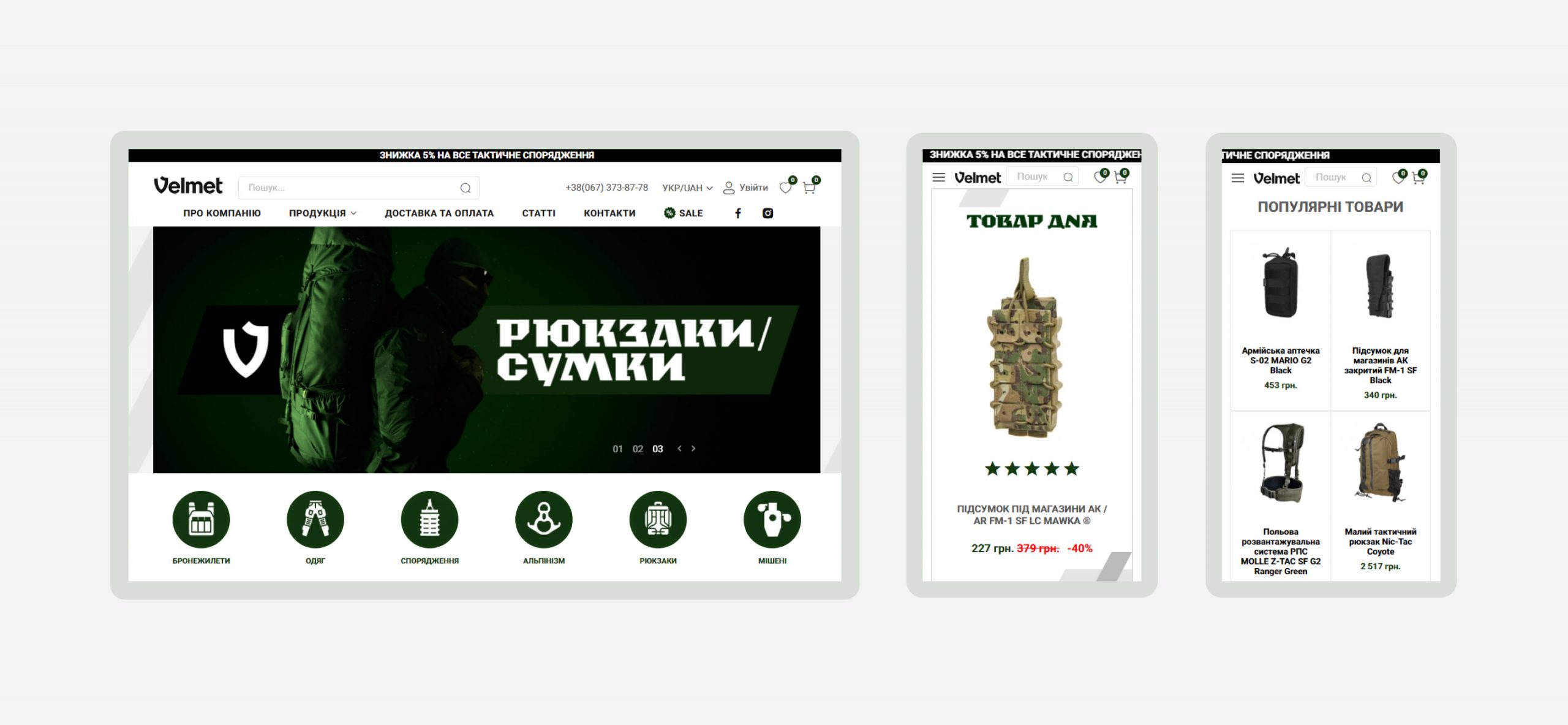
Redesign of online store of tactical and military equipment for a brand, manufacturer “Velmet.ua”.
Tasks
- create a convenient online store that meets the requirements of trade in military ammunition;
- change the previous web-design in accordance with the latest trends of design;
- show a wide range of army equipment and armor in sections with clear names;
- update company information and poste new video-materials;
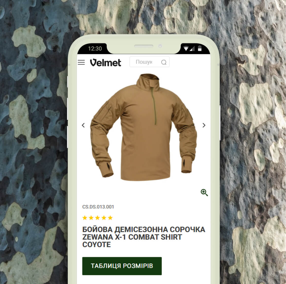
- adapt the new design to mobile devices and keep the convenience of functionality.
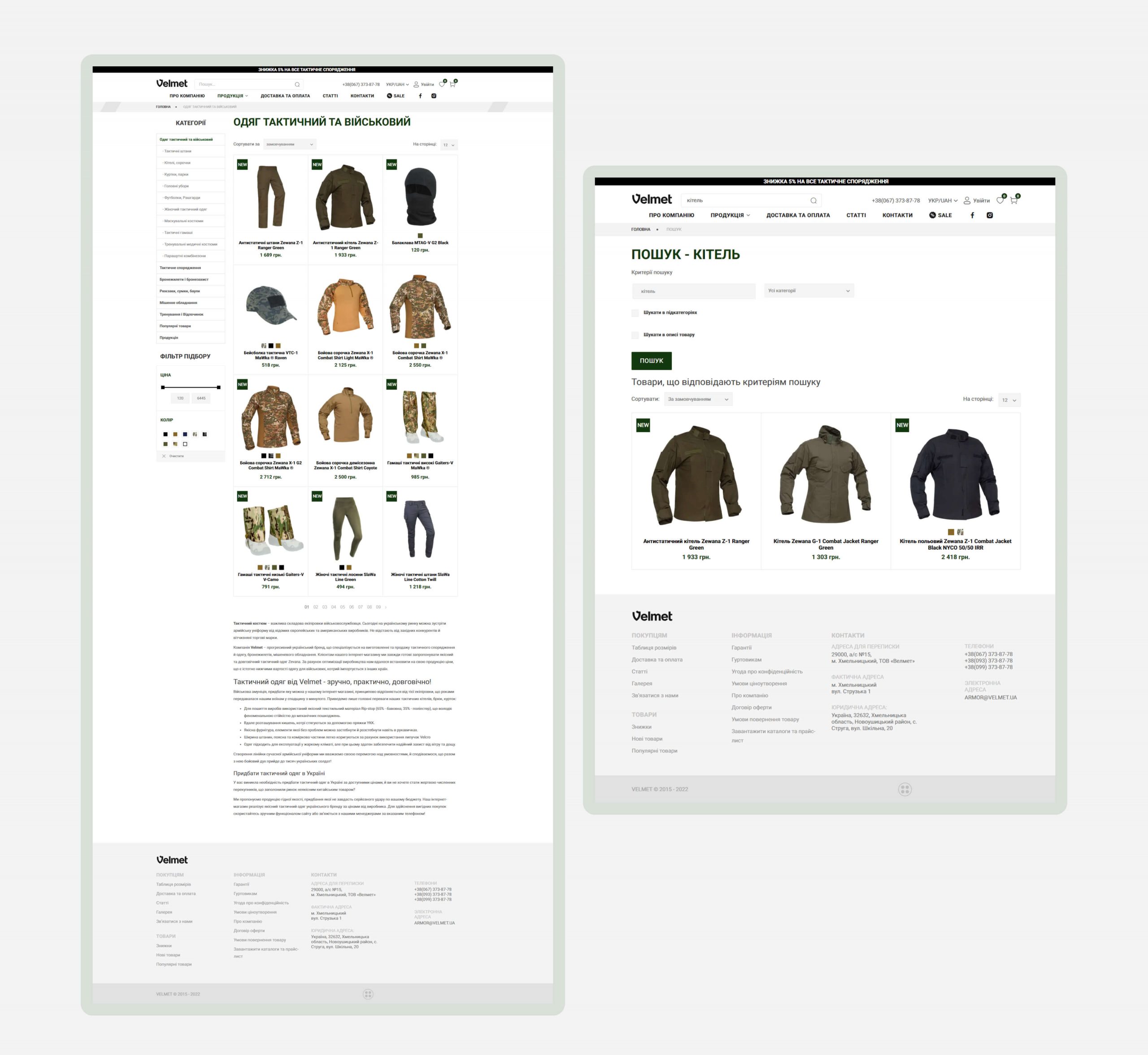
Product catalog
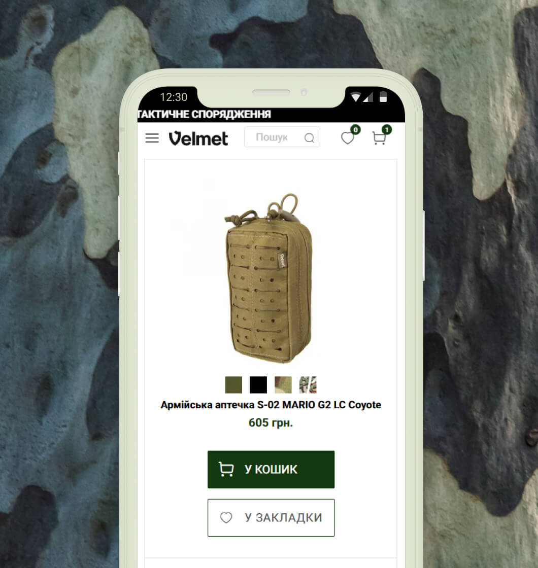
The product catalog is divided into categories according to the purpose of the products. Customer can choose a convenient number of products that will be displayed on the page of one category (12/25/50/75/100). Directly from the catalog page, by pointing the cursor at the product, user can quickly add the product to the basket or bookmarks for further product comparison. The design of the catalog is as concise and simple as possible in order to focus the attention of the Client’s military audience on specific things and purchases without wasting time.
Challenge
With the Ukrainian manufacturer of military products and agricultural machinery we have been cooperating for almost 5 years. During this time were created previous versions of the online store, imlemented several landing pages for new business projects of the Customer and transferring content from outdated CMS to a convenient and up-to-date CMS. See the case for the Client’s brand – HOFNER.
- The challenge in this case was to keep and convey the corporate identity of the Client and modernize the design of the online store in accordance with the latest trends in e-commerce web design.
- It was necessary to add new and sort existing products so they will be able to form a single intuitive catalog.
- Also, we needed to style the internal pages and optimize the resource for the updated requirements of search engines.
Product card and checkout
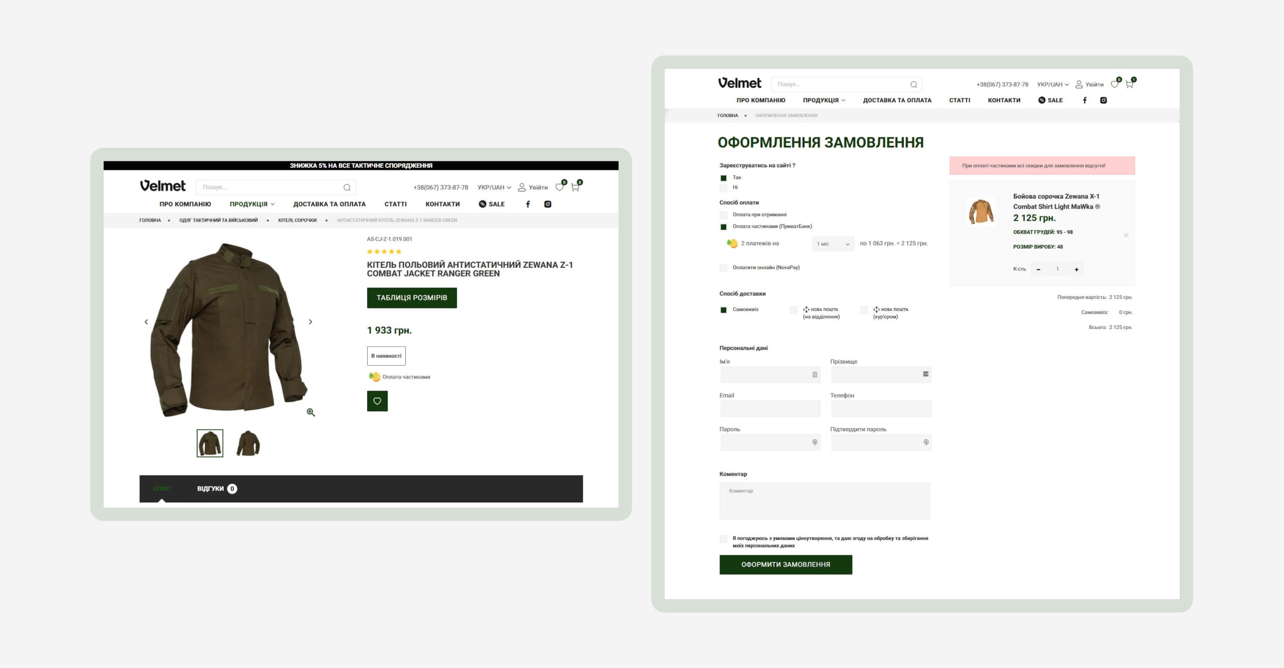
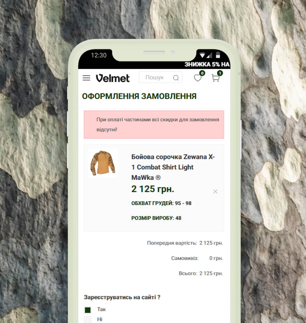
It is important for a potential buyer of a military online store not just to see the product, but to know information about its functions, efficiency, material, and additional characteristics. Therefore, the emphasis in the product card is focused on the photo and product characteristics, which play a decisive role in the choice. The table of sizes is available for all types of products and opens as a separate page. A buyer who has already made a purchase and felt satisfied is a factor that encourages another person to make a purchase. Therefore, we placed reviews in the product card and product rating in the form of stars already below the product name. Viewed and recommended products at the bottom of the card page allow a person to complete their shopping cart and stay on track with the purchase process. When placing an order, the buyer can choose to make payment by installments. So, we integrated this type of system for payment from PrivatBank, because this was required by the target audience of the online store.
Solutions
- created a modern, simple, concise design;
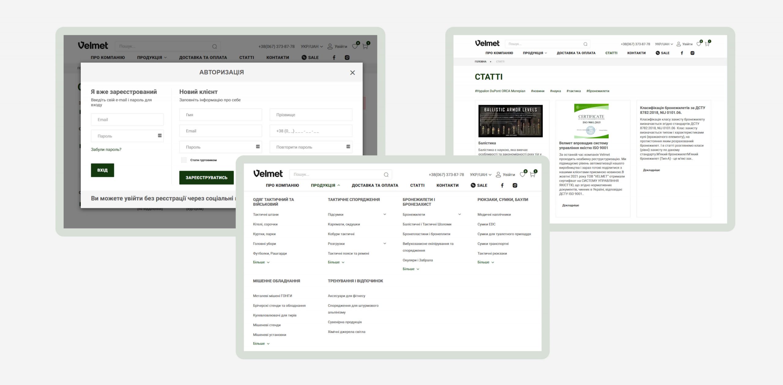
- introduced a convenient menu, product selection filter, blog, divided into articles by categories;
- implemented a point banner: now it is enough to make a mark on the promo photo and the relevant products depicted on it will be automatically uploaded;
- made it possible to purchase without registration on the site and sharing the goods in the social networks;
- painted a new design of the main pages with photo materials, including models of adaptives;
- integrated videos from the Customer’s YouTube channel;
- adjusted the adapter according to the new design;
- introduced multicurrency and multilingualism;
- optimized the resource for updated search engine requirements and Web Vitals and Google Lighthouse tools;
- tested the project after the implementation of changes.
Additional functionality
The administration panel has a convenient menu, where data on orders, sales and buyers are provided. Our Client can create and review sales reports (for products that customers most often viewed and bought products). We also integrated the online store with Google Analytics and synchronized it with the 1C accounting system. The CMS that we used to develop this site allows our Client to make and store a backup of the store – a backup copy can be restored from the admin panel.
As a result, we got a modern and practical online store where a new concise design is integrated into existing functionality. Why you do not need to be afraid of redesign and how best to organize this process – we talk in a video on our YouTube channel.
To lead the eCommerce market, you need ambition and possibilities to grow. We assist our clients in achieving real business results.


